Welcome! Today’s chosen theme is: Top Color Trends for Modern Homes. Explore fresh palettes, practical tips, and inspiring stories to help you color with confidence. Join the conversation, subscribe for weekly palettes, and share your favorite trend picks.
Modern homes balance calm and character. Soft neutrals lower visual noise, muted greens ease stress, and bold accents energize creative corners. The right palette supports routines, relationships, and rituals, turning everyday spaces into intentional, uplifting environments.
Why Color Trends Matter in Modern Homes
Trend forecasts reflect how we live now: hybrid work, wellness, and sustainability. Paint houses spotlight warmer whites, nature-rooted greens, and spice tones. Designers pair color with texture, light, and layout to create homes that feel personal yet current.
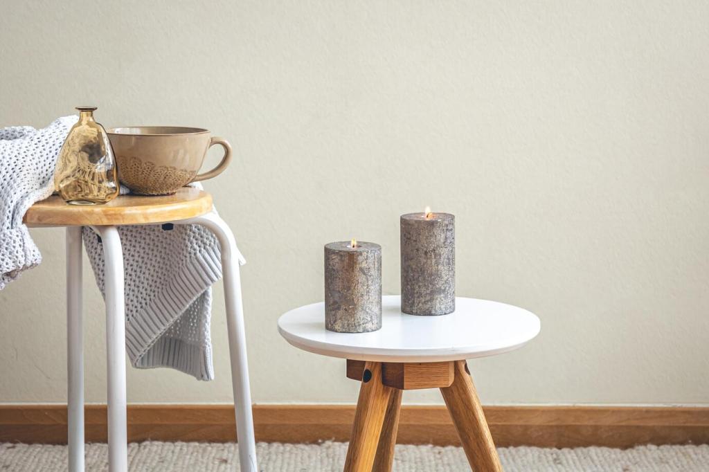
The New Neutrals: Warm Whites, Greige, and Mushroom
Cozy, not cold
Cool gallery whites can feel stark in lived-in rooms. Warm whites with a whisper of yellow or red undertone wrap spaces in softness. They flatter wood, stone, and skin tones, making gatherings glow and weeknights feel unhurried.
Texture makes neutrals sing
Pair greige walls with boucle, linen, and burnished metals for dimension without visual clutter. A mushroom backdrop lets textures take the spotlight, allowing art, plants, and patina to create movement while the palette quietly grounds everything.
Try-before-you-commit testing ritual
Brush big swatches on two walls, observe morning and evening light, and photograph them daily. Post your top two in the comments and ask the community which undertone reads calmer in your space. Crowd wisdom often catches surprises.
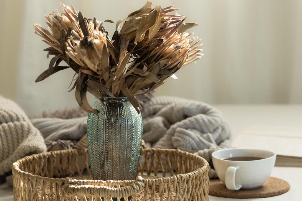
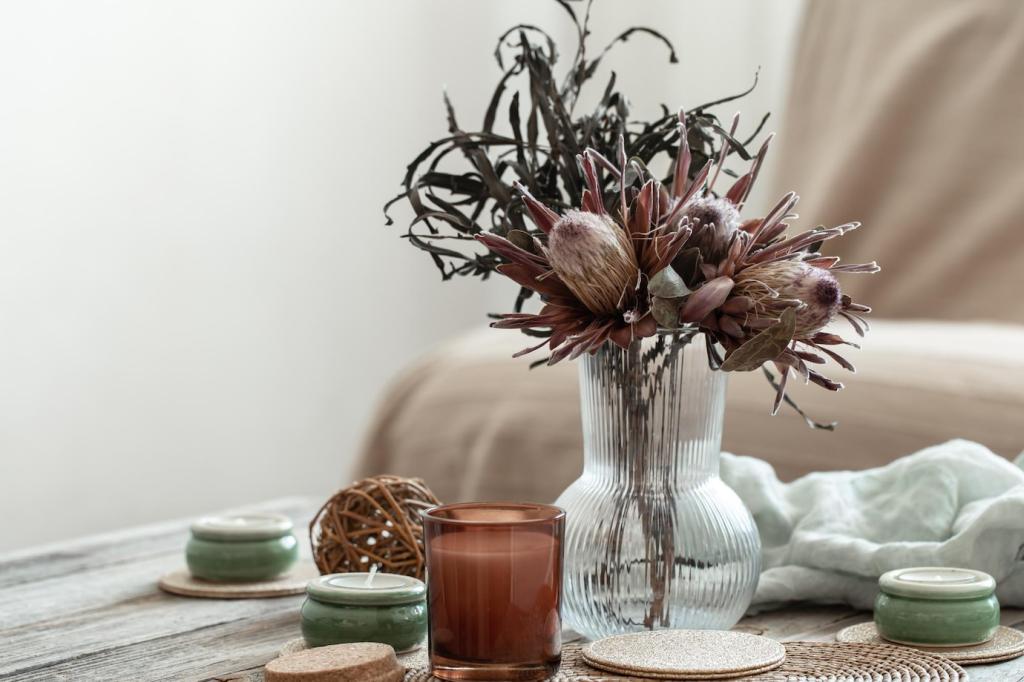
Earth and Biophilic Greens
Olive, sage, and eucalyptus harmonies
Olive feels grounded in living rooms, sage brings serenity to bedrooms, and eucalyptus freshens kitchens. Layer them with natural wood, cane, and matte black hardware. The result is tranquil yet modern, like a gentle walk through shade.
Paint plus plants: a living partnership
Match sage walls with trailing pothos, or temper deep olive with silvery eucalyptus stems. Plants amplify paint’s mood while paint spotlights foliage forms. Together they frame windows, soften corners, and make air and eyes feel rested.
Share your green corner challenge
Paint a small niche in your chosen green and add one plant and one natural texture. Snap a before-and-after. Comment with your recipe—paint name, plant pick, and texture—so others can recreate that restorative, biophilic moment at home.
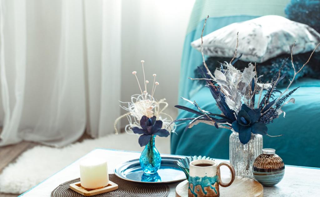
Try aubergine inside a bookshelf, cobalt on a window frame, or paprika behind a headboard. These micro-accents frame views, anchor vignettes, and create delightful surprises. Start small, then echo the hue in textiles for rhythm.
Balancing intensity with light
Bold colors love daylight and layered lamps. Pair saturated walls with soft linen shades and warm bulbs. Reflective elements—mirrors, satin metals—bounce light, preventing heaviness. Keep ceilings lighter to lift the gaze and maintain breathable proportions.
A renter’s removable color win
Dee wrapped foam panels in paprika fabric for a dramatic, renter-friendly headboard wall. It looked custom, calmed echo, and peeled off in minutes. What removable accent could you try this weekend? Share your idea and we’ll cheer you on.
Matte hides imperfections and looks sophisticated in low-traffic rooms. Eggshell balances cleanability with softness for living spaces. Satin suits kitchens and baths. Sample the same color in two sheens; you’ll be amazed how mood shifts.
02
North light cools colors; choose warmer undertones. South light intensifies brightness; consider slightly grayer versions. Observe your space at breakfast, midday, and dusk. Consistent notes help you pick a shade that stays lovely all day.
03
Combine overheads, task lamps, and wall washers to reveal color’s depth at night. Dimmers add flexibility, while warm bulbs flatter skin and textiles. Subscribe for our weekly lighting-plus-color tips to keep evenings cozy and visually calm.
Choose low- or zero-VOC paints and verify third-party certifications. Better air supports sleep and focus, especially in bedrooms and offices. Ask your retailer for data sheets, and share your favorite responsible brands with our community below.
Sustainable, Healthy Paint Choices
Use peel-and-stick samples or decant small tester pots into reusable trays. Plan palettes across multiple rooms to finish leftovers. Document exact formulas for easy touch-ups, saving money and preventing half-used cans from gathering dust.